Overview
As part of Level’s mobile app re-architecture, I redesigned the Funds page to make benefits coverage and balances clear and trustworthy. It became the core experience where employees confidently understand their benefits while reducing support requests for employers.
Platform
Member-facing mobile app (iOS + Android)
Role
Senior Product Designer – end to end
Timeline
1 month
Team
Head of Design, product, engineering, and benefits experts
Problem & research
Employees relied on the Fqunds page to understand their benefits, but coverage details were buried, balances were confusing, and transactions lacked context.
Many ended up submitting support tickets to Level’s team. From support data, employer feedback, and member interviews, coverage clarity surfaced as the top issue to solve.
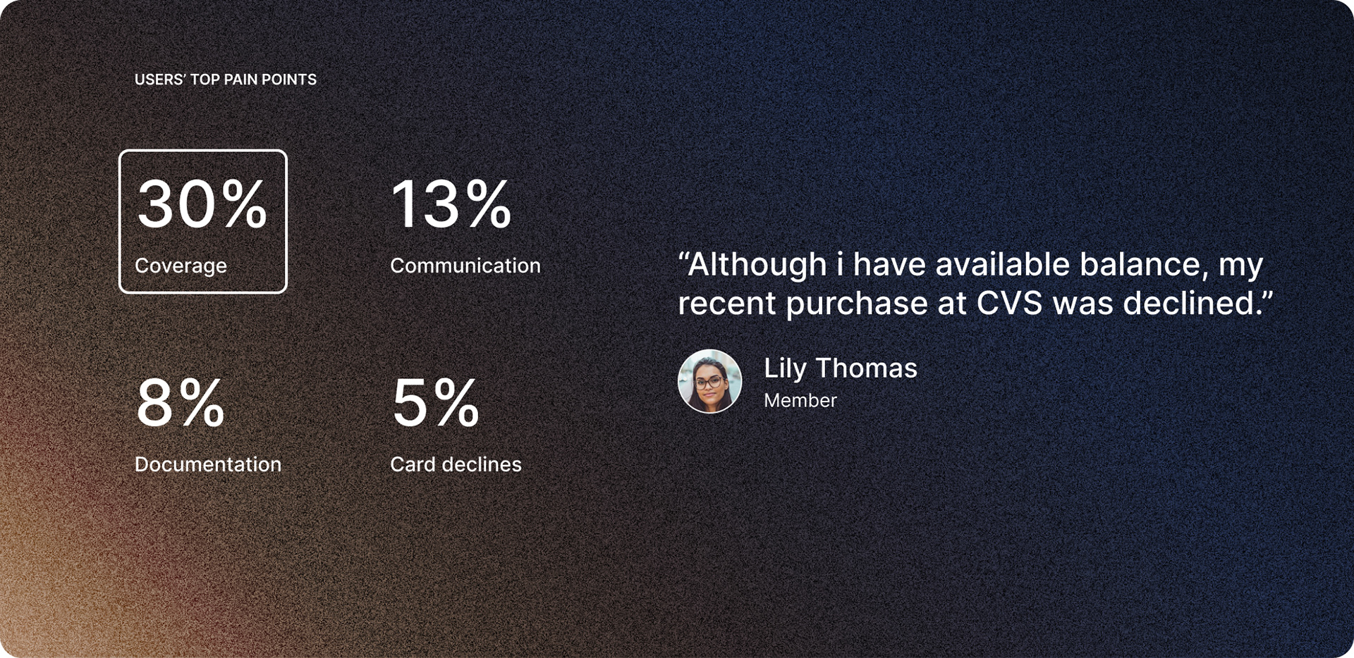
User feedback showing coverage as the top user pain-point, thus shaping the design and hierarchy of our funds page
Information Architecture
I mapped how funds and plans related to each other.
Employees often had multiple plans (e.g., wellness stipends, work-from-home allowances, health funds), and the structure was confusing.
Clarifying this hierarchy guided the redesign and made navigation simpler.
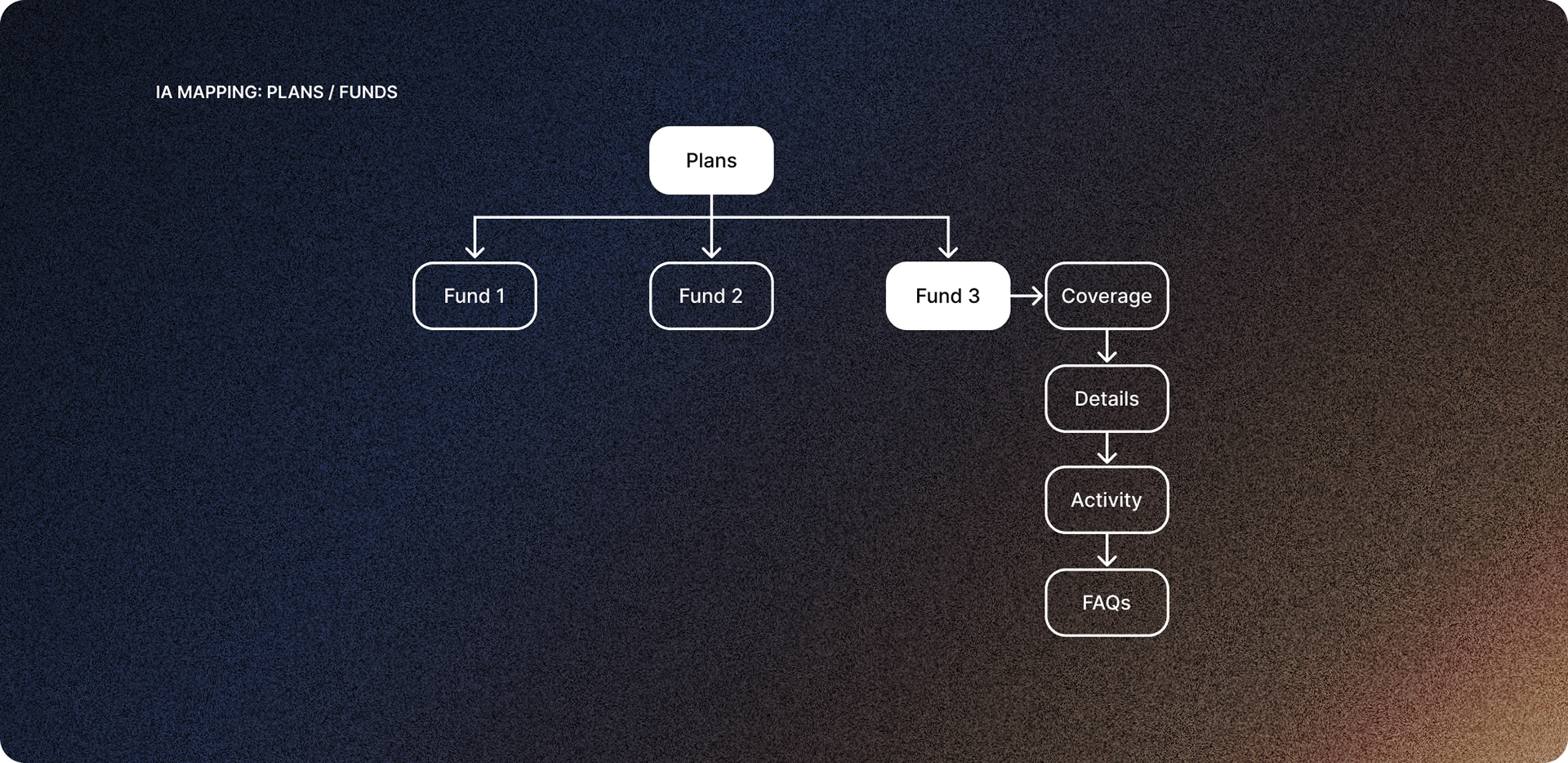
Information architecture map showing plans and their multiple funds, and the hierarchy of data within each fund.
Early wireframes for quick feedback
I created low-fidelity wireframes to test content order and layout with product and engineering.
Quick feedback loops with benefits experts revealed a critical need: conditionally covered items (e.g., streaming services) had to be clearly separated from excluded items (e.g., firearms).
This insight shaped the hierarchy of the final page.
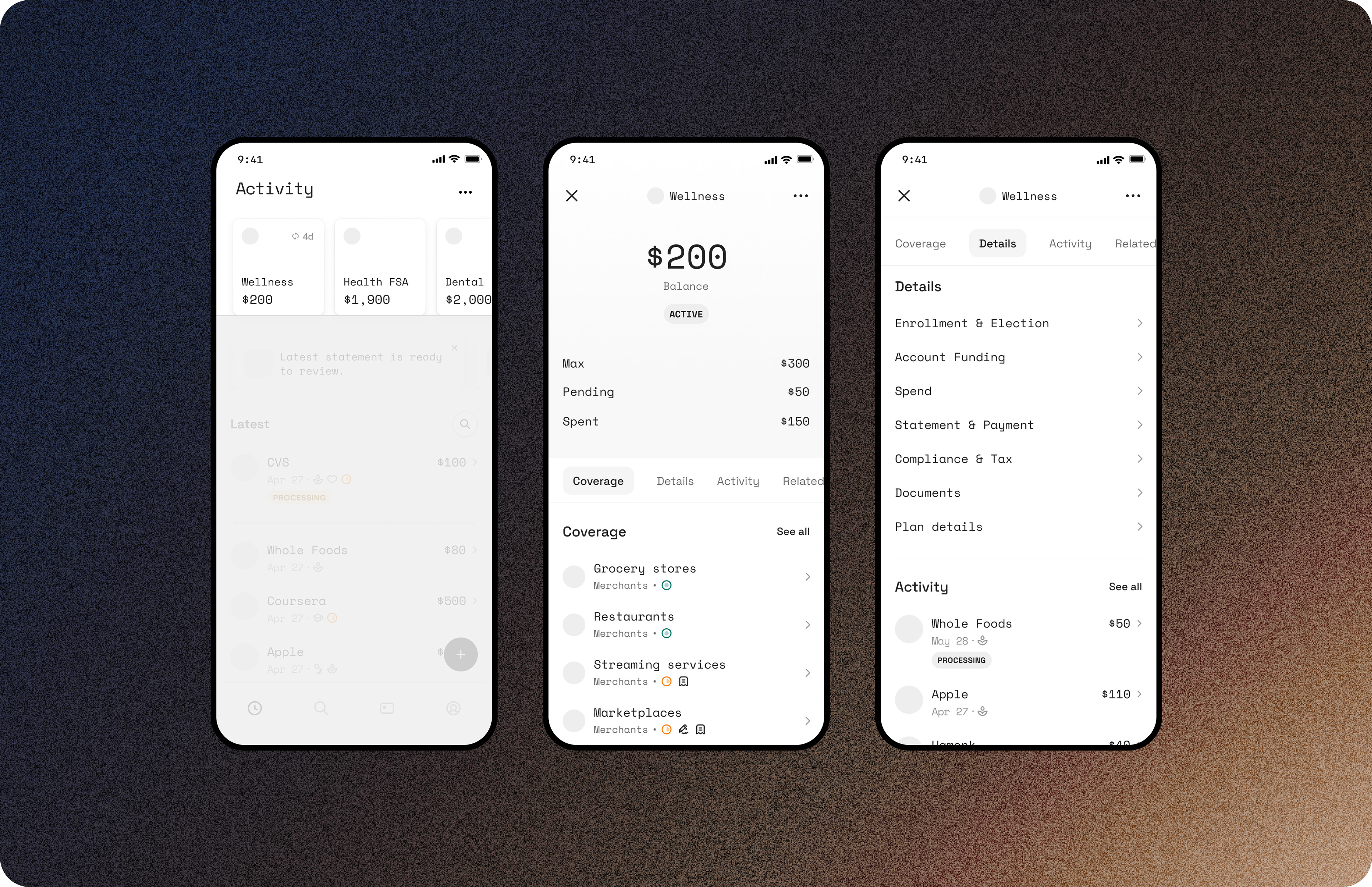
Mid-fidelity wireframes showing the fund page for early stakeholder feedback and alignment
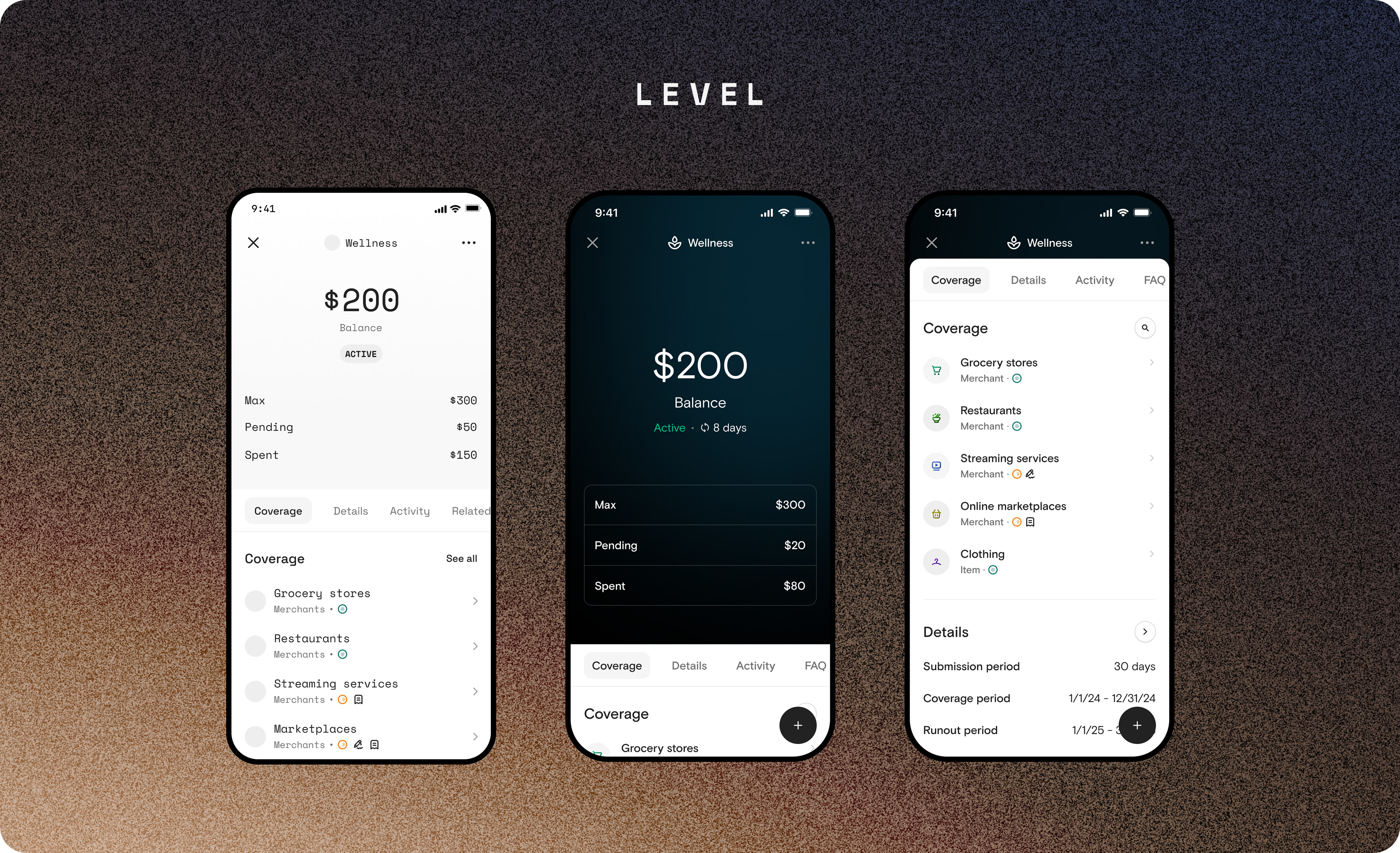
Solution
The redesigned Funds page became a single, trusted place where employees could see what was covered (and what wasn’t), check real-time balances, and review transactions with receipts and claim forms tied to each purchase. I adapted design system components for mobile, added accessibility improvements, and delivered motion specs with Lottie files to make interactions smooth and intuitive.
Outcomes
📈 Increased member engagement with the Funds page by 28%
📉 Reduced coverage/balance-related support tickets by 35%
📉 Reduced coverage/balance-related support tickets by 35%
“After the update, our employees finally stopped asking us to explain their balances. It’s freed up a lot of my team’s time.” — Employer feedback (anonymous)
Learnings
Some of the most valuable changes happened late in the process - iteration didn’t stop at high fidelity. Templates and guided flows reduced confusion, and future opportunities include AI-driven recommendations, automated claim tagging, and employer reporting tools.
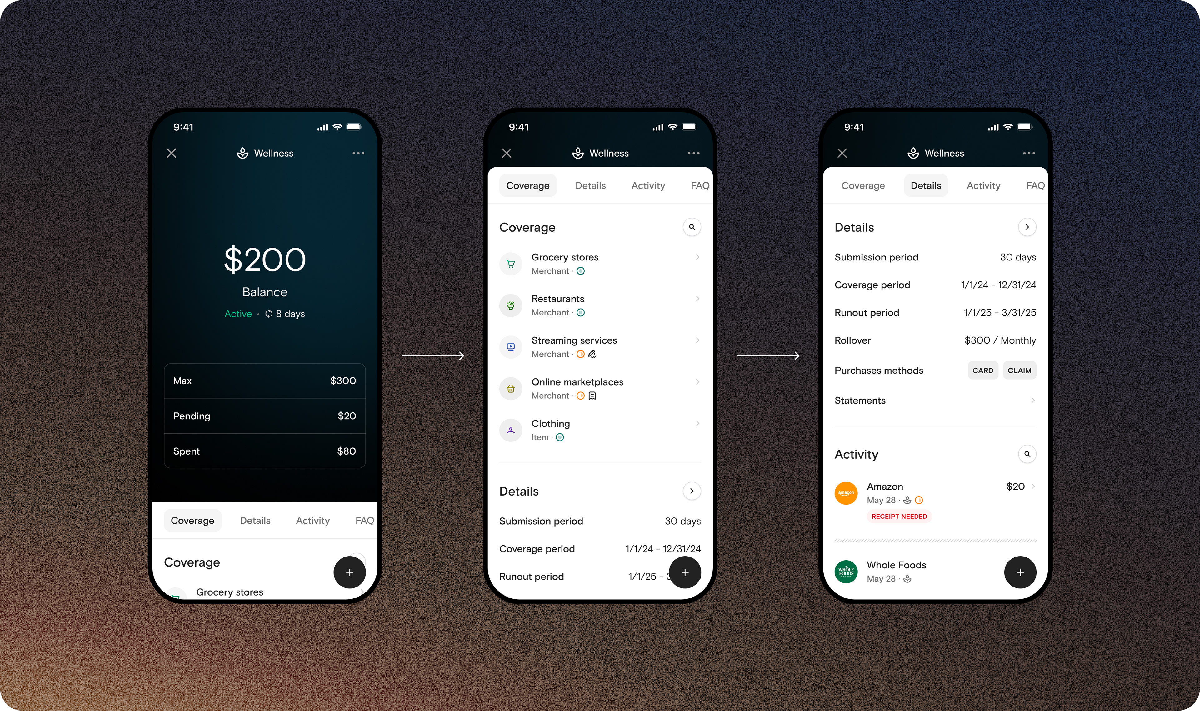
High fidelity screens of the fund page, showing coverage and details sections